Blurb
The Blurb element allows you to provide a short text description that provides additional context or instructions to your visitors submitting the form. It is designed to clarify, guide or explain the related form content.
Placement of the blurb on your form can be where it is needed most. This can include above, below or beside the field that it pertains to.
It is often placed in a way that attention will be drawn to the blurb, such as as using a different font color or making the blurb content bold.
Blurb elements are usually concise and informative.
They might include:
- Instructions
- Examples
- Clarifications
- Warnings
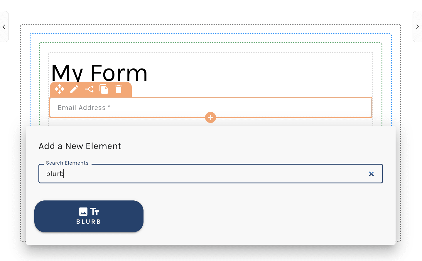
When you create any new form, a blurb element is in place at the top of the form and is set to "My Form".
This blurb can be edited by selecting the pencil icon in the top left corner of the element, or removed completely using the trashcan icon.

Add a Blurb Element to Your Form
To add a Blurb element to your from select the orange + icon within the builder and select "Blurb".

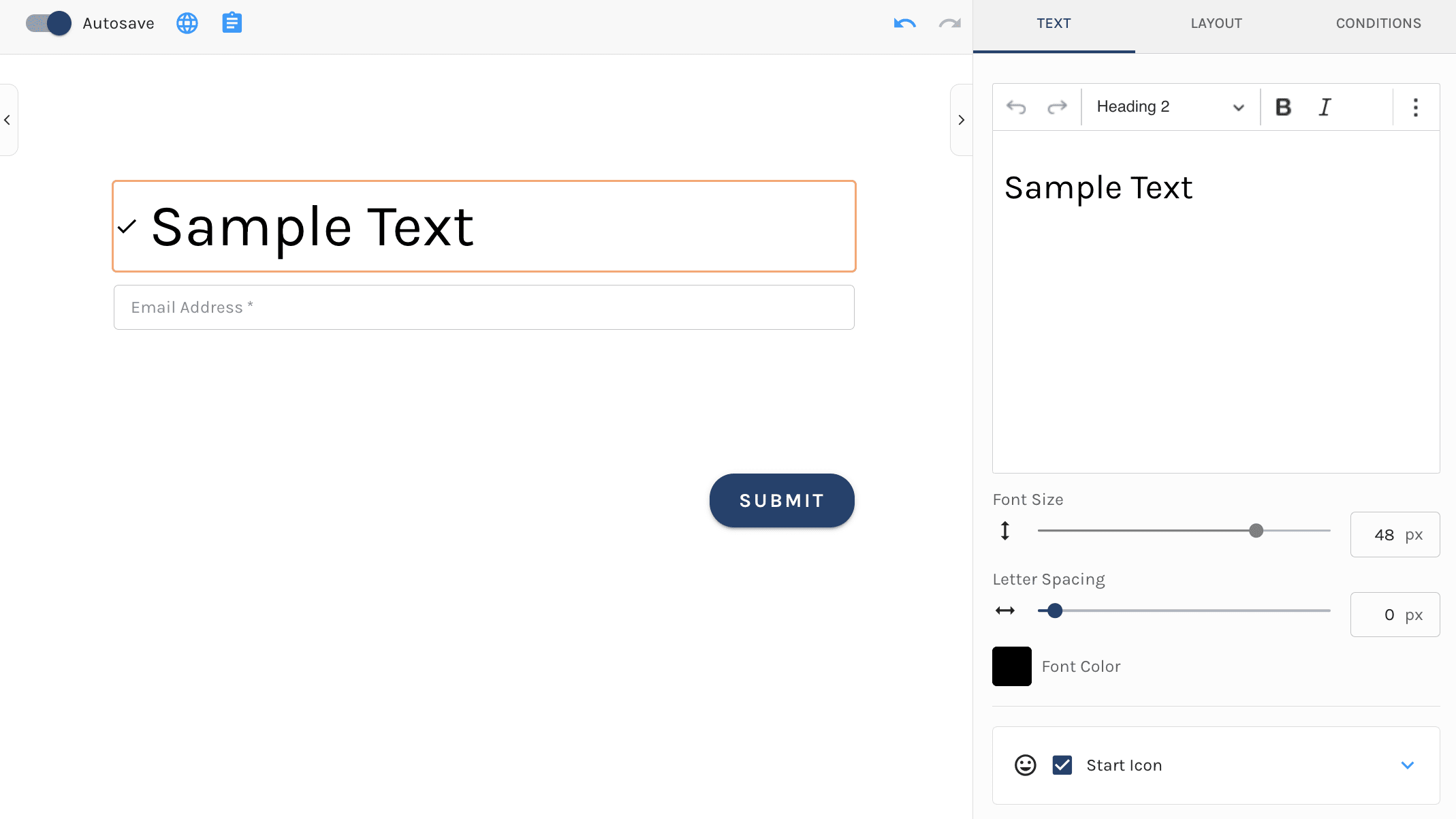
By default when you add a new blurb element to your form "My Sample Text" will be the blurb's content.
When the element is added to your form, on the left hand side of the screen the element editor will display. Here is where you can edit the content.

Blurb Element Text Settings
Within the text settings of the blurb element you are able to provide the text for the blurb and edit it's styles.
The blurb text provides a text box area in which you can input your blurb.
The editor allows for editing of:
- Headings (H1-H6) & paragraph text
- Bold your text
- Italicize your text
- Add links
- Block Quotes
- Bulleted Lists
- Numbered Lists
- Font Size : Use the slider to easily adjust
- Letting Spacing: Use the slider to easily adjust
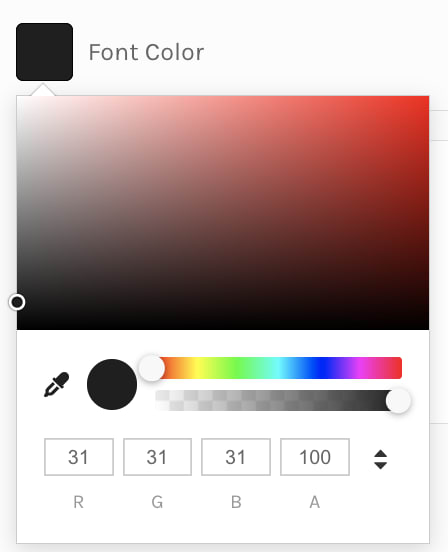
- Font Color: Choose a color from the color wheel or enter the RGBA of a color. Alternatively use a color picker to select a color from the page to apply

- Start Icon: The Start Icon allows you to add a icon or color to the blurb. If you do not wish to have an icon, uncheck this checkbox
- Availble icons include: Add, Check, Circle & Close
- Choose a color from the color wheel or enter the RGBA of a color. Use the color picker to select a color from the page
Layout
Under the layout tab you have the ability to edit the layout of the blurb.
Here you can set the blurbs:
- Alignment (Left, Center, Right)
- Witdh
- Margins (Top, Bottom, Left, Right)
Easily set these parameter using the slider, or input the value to the right of each layout option.

Conditions
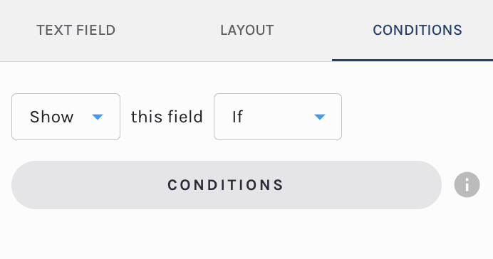
By default the field is set to show always. That said, you have the ability to edit the fields visibilty to conditionally display.

If you would like to edit the visibilty of the form field update the settings under the conditions tab.
You can set the field to:
- Show This Field Always
- Hide This Field Always
- Show This Field If
- Hide This Field If
Selection of the last two will prompt you to set conditions of display for this field using the Paminga segemnt builder.

The conditions available to dispaly off of are:
- Account Fields (standard & custom)
- Contact Field (standard & custom)
- Form Fields: Set the conditons based on any field's value on your form
- Language: If you leverage "Internationalization" each language you have added to the form will be available to select here

Make sure to check out our in-depth documentation here.
