Checkbox
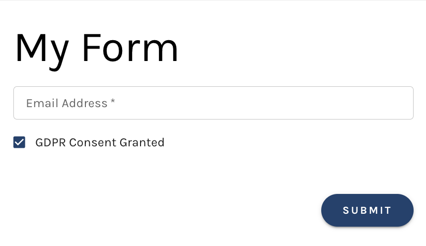
A Checkbox element is used to represent a binary choice, where your visitor can select one of two possible values: True (Yes) or False (No).
It is often used for simple yes/no questions.
Other common uses include:
- Agreement: To confirm whether a user agrees to terms and conditions, policies, or rules.
- Consent: For actions like confirming participation, subscription, or permission.
When the checkbox is checked it represents a true value. When the checkbox is unselected it represents a fasle value.

Add a Checkbox Element to Your Form
To add a Checkbox element to your form select the orange + icon within the builder and then select "Checkbox".

Once the checkbox has been added to your form please edit the settings of checkbox via the right hand side of the screen.

Checkbox Element Settings
Within the true/false settings of the checkbox element there are various options to set.
These include:
- Field Label: Value that is always visible to persons filling in your form
- Field Name: The Field Name is "behind the scenes". The field name is not shown to persons filling in your form
- Map to Field: Select the Paminga field you would like to map the checkbox to. All of your booleen standard and custom fields will be available to map to
- Default to True: Check this checkbox if you would like the checkbox to be checked (set to true) for visitors viewing the page
- Pre-Populate this Field: Paminga may be able to recognize the website visitor submitting your form. When this is the case, you can have Paminga pre-populate fields with values that are already known for that person
Validation Rules
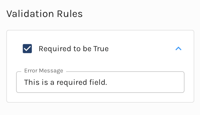
Within the Checkbox settings you can set validation rules for the persons submitting the form. If you choose to set the validation rule for a checkbox it will require the visitor to mark the field.
By default a message the message is set to "This is a required field." This message can be edited.

Layout
Under the layout tab you have the ability to edit the layout of the checkbox on your form.
Here you can set the checkbox :
- Alignment (Left, Center, Right)
- Witdh
- Margins (Top, Bottom, Left, Right)
Easily set these parameter using the slider, or input the value to the right of each layout option.

Conditions
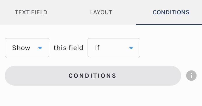
By default the field is set to show always. That said, you have the ability to edit the fields visibilty to conditionally display.

If you would like to edit the visibilty of the form field update the settings under the conditions tab.
You can set the field to:
- Show This Field Always
- Hide This Field Always
- Show This Field If
- Hide This Field If
Selection of the last two will prompt you to set conditions of display for this field using the Paminga segemnt builder.

The conditions available to dispaly off of are:
- Account Fields (standard & custom)
- Contact Field (standard & custom)
- Form Fields: Set the conditons based on any field's value on your form
- Language: If you leverage "Internationalization" each language you have added to the form will be available to select here

Make sure to check out our in-depth documentation here.
