Landing Page Builder Basics
Once you have added a landing page domain to your Paminga account you are ready to start building amazing pages with the Pamgina Landing Page builder. Let's go over some basics to help get you familair with our builder!
Drag and Drop Builder
Paminga provides a Visual Landing Page builder that will allow everyone to create useful and appealing Landing Pages to match your current website. No coding background is required!
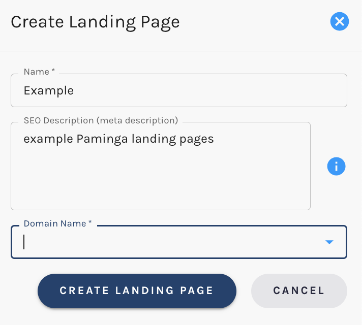
To create a new Landing Page Navigate to Marketing > Landing Pages > and select the "+" icon.
When creating your landing page you will be asked to select:
- A name: Tthis will be the URL of your landing page once it is published
- SEO Description (meta description): This populates the "meta description" HTML tag on your Landing Page. This tag allows you to provide a summary of the page's content. Search engines often use this description to display a snippet of information in search results, offering your audience a preview of what to expect on the page (optional)
- Select the landing page domain: Choose which domain you would like to build this page on

Once these items have been set select "Create Landing Page" and you will be taken straigh to the builder.
Landing Page Settings
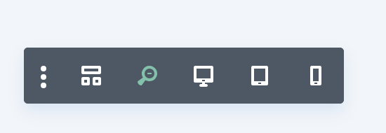
Once your landing page is created and you are in the editor building, you will notice three dots at the bottom of the page.
Click on these to expand the options for Landing Page Settings.
Once selected you will see the Settings that you have control over. Hovering over each will provide you with a label.

These Settings include:
- Page templates: Here you can select templates that Paminga has already made to add to your entire page or select options from your saved Library
- Save page to library: Have a page design that you will use again and again? Select this option to Save a page to your library for future use
- Clear the page: Start from scratch and remove all the current page content
- Page settings: Here you can update the background, color palette & text of your page. In addition, if you are leveraging Custom CSS for your page or forms on your page, here is where you will enter the CSS styling
- Page edit history: Here you can see previous edits made to your page and revert to a previous rendition
- Return to Paminga: Click here to return to your Paminga UI
Main Navigation
In addition to Page Settings a variety of view options are available on the right-hand side of your screen including:
- Builder Settings: Choose the settings for the builder including:
- Customizing the toolbar
- Builder Default View Mode
- Builder Default Interaction Mode
- History State Interval
- Settings Modal Default Position
- Page Creation Flow
- Builder Interface Animations (select to turn on and off)
- Show Displayed Modules at 50% Opactiy (select to turn on and off)
- Group Settings Into Closed Toggles (select to turn on and off)
- Add Placeholder Content to New Modules (select to turn on and off) -Theme Builder Template Editing (select to turn on and off)
- WireFrame View: Perfect for seeing the bones of your page. This view can be beneficial on a fully populated page when you are trying to delete or add a module or when you are trying to plan/view the entire layout of a page
- Zoom: Allows you to view and edit the page zoomed in and out
- Desktop View: Edit while viewing how the page will render on a desktop
- Tablet View: Edit while viewing how the page will render on a tablet
- Mobile View: Edit while viewing how the page will render on a mobile device

Landing Page Elements
The Builder allows you to set up your landing page from top to bottom by combining 3 structural elements. These are Sections, Rows, and Modules.
Sections
Sections organize rows and are the largest organizational element and they are the first element you will add to your page. Sections are designated in blue.
There are three types of sections:
- Regular: made up of rows of columns
- Specialty: allow for more advanced sidebar layouts
- Full Width: made up of full-width modules that expand the entire width of the screen.
Rows
Organize the modules by keeping them in line! Rows can be full page width or have columns. There is no limit to the number of rows. Rows are designated in green.
Modules
They are the content of your page: text, sliders, pictures, etc. Modules are fully responsive to the width of Rows and Sections. Modules are designated in grey.
Have questions on a specific Module type? Want to know how it works? Check out docs for an in-depth dive on each Module type!
Element Options
Each element has its own menu that allows you complete control.
These options include:
- Moving the element
- Element settings (covered in detail below)
- Duplicating the element
- Save element to My Library
- Delete element
In addition rows will have an option to change the layout within the row.
Element Settings
You can access an elements settings panel by clicking the gear icon that exists when hovering over any element on the page.
This will launch the settings panel for the specified element. Each settings panel is broken up into three tabs:
- Content: The Content tab of course is where you can add content such as images, video, links, and admin labels
- Design: The Design tab is where we’ve placed all of the built-in design settings for each element. Depending on what you’re editing you can control a wide variety of design settings with a click; including: typography, spacing (padding/margin), button styles, and more
- Advanced: The Advanced tab is where you can apply custom CSS, adjust visibility based on the device, and (depending on which element you’re editing) do even more fine-tuning
