Accordion Module
The accordion module is a great way to break out key information and organize it into smaller more accessible pieces that are easy for readers to digest. Accordions are very similar to tabs, except that the information is displayed within a vertical list. When a new item within the list is opened, the previously opened item is closed and the new item’s content is displayed.
Adding the Accordion Module
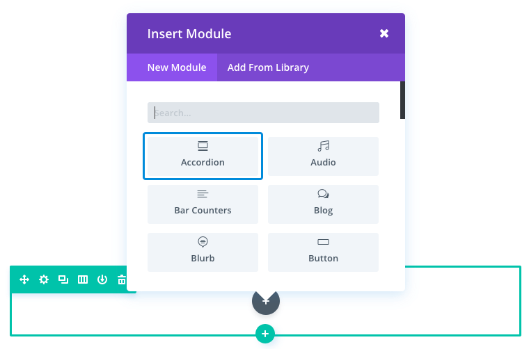
To add an Accordion Module click the grey “+” button and select Accordion.

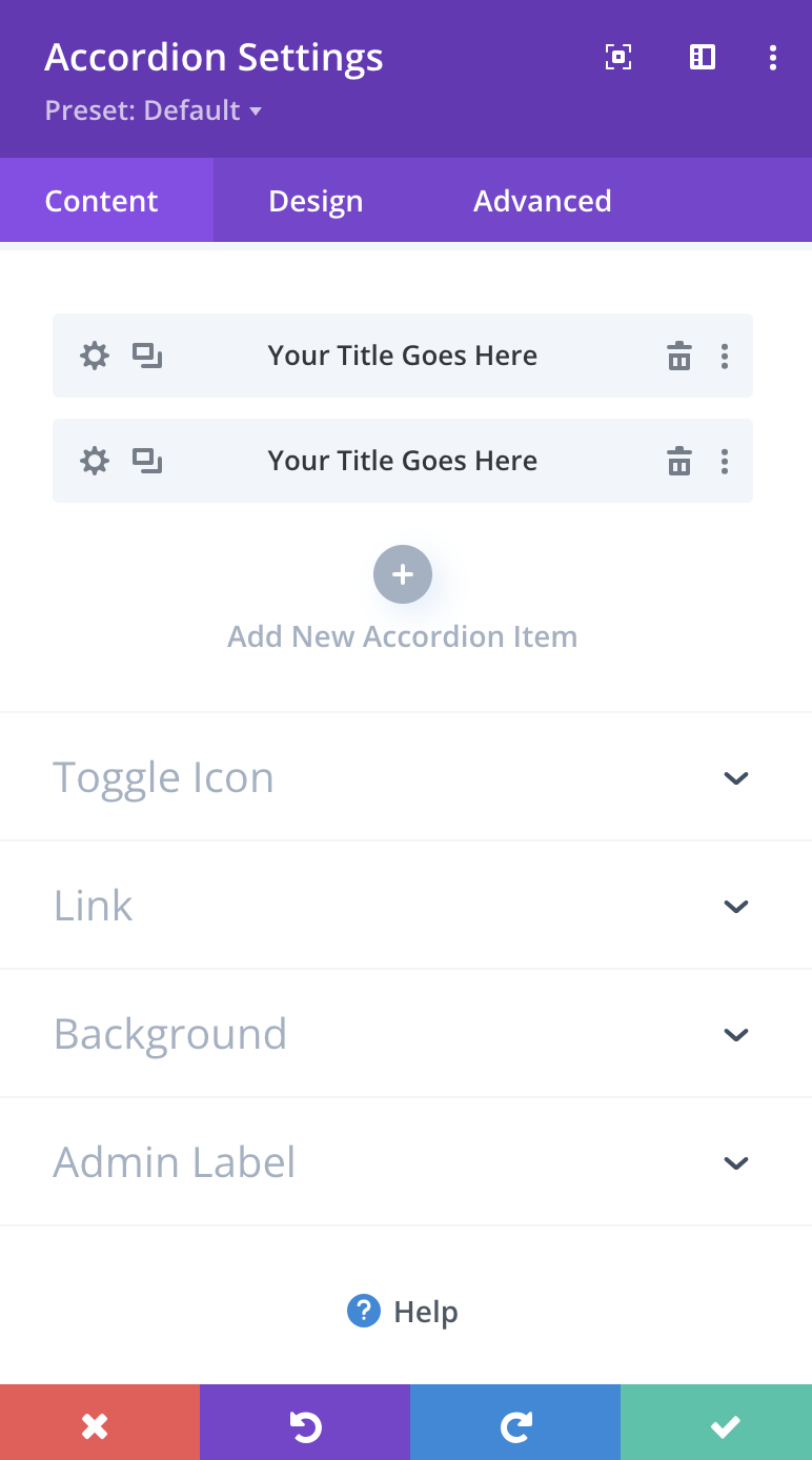
Then use the “+” symbol within the editor to add as many toggles as you want.

Customize the Accordion Module
Once you’ve added a toggle, you can modify its content and how it will be displayed using the following customization options: Content, Design, and Advanced.
You are able to access these features by clicking on the gear icon on each Toggle. Customizations made here do not effect the entire module, rather the individual section of the accordion.
Content Options
The content options of your Accordion will consist of your accordion topics and the background and label associated with them.
Accordion
Begin adding your accordion by clicking the plus sign that appears when you open the Content Options. When you’ve done this you are asked to give it a title and some content. You can also apply a background directly behind individual accordions.
Background
Choose from a variety of background options to help decorate your accordions. These choices can be solid colors, images, and even videos!
Admin Label
This will change the label of the module in the builder for easy identification.
Design Options
The design options will allow you to change the appearance of your accordions to match the appearance and tone being used on your landing page. You’ll be able to make changes to the following aspects of your accordions:
- Accordion Icon Design:Begin designing your accordion icons by setting the color for each accordion being used
- Text Design: Customize the font size, color, and more for your Toggle, Body Text, and Title Text
- Formatting Design:Customize the size and spacing of your accordion to help create the perfect balance inside and out. Continue changing the appearance by customizing the surrounding border, shadows, and animations or filters
Advanced Options
Want to make some changes that may require some additional coding? Look to the advanced tab to make changes to the way your timer is being seen by your visitors.
CSS ID & Classes
Add additional CSS Styling by using IDs or classes. These can also be used to create links to particular sections of your page.
Custom CSS
The Advanced tab also allows for you to further design your timer module by adding custom CSS that you can enter based on the field of depth options available to you (Before, Main Element, and After).
Accordion Modules also give you the option of utilizing custom CSS for your toggle by customizing the title, icon, and content.
Visibility
This option allows you to control which devices can view your timer. You decide to disable the visibility for phones, tablets, and browser windows by checking the box next to the devices you’d like to exclude.


