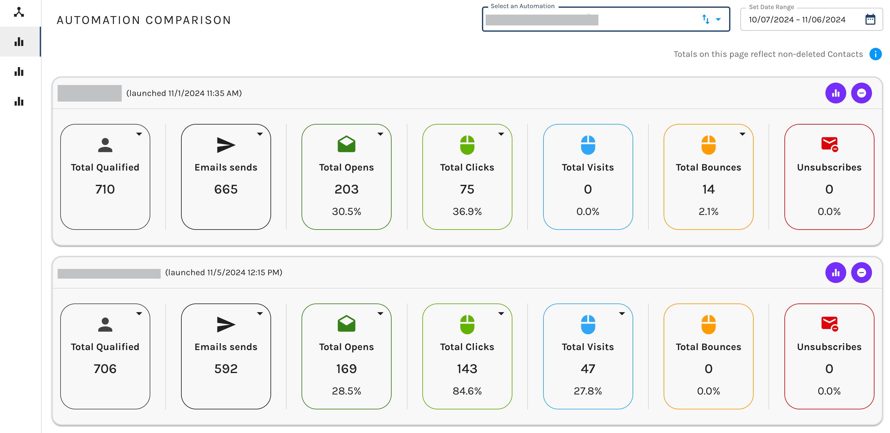
Automation Comparison Dashboard
The Automation Comparison Dashboard allows you to compare stats between two or more Automations (add as many as you would like).
The stats shown are:
- Email Sends: The amount of emails sent out
- Total Opens: How many unique opens occurred
- Total Clicks: Cumulative clicks on any link in your emails
- Total Visits: Visits to your website from a link in an automation email
- Total Bounces: All bounces to contacts within the lifecycle of the automation
- Total Unsubscribes: All Contacts who unsubscribed during the automation

Navigating the Dashboard
When you first come to the Automation Comparison Dashboard, you will be greeted with a blank page. You’ll need to select the automations you wish to view and adjust the timeframe to your preference using the dashboard options outlined below.
To add an automation click the dropdown in the top right and select the automation you would like to review. You are also able to adjust the timeframe in the top right to view stats from the most recent 7 days up to the last 12 months.
If you want to dig deeper into the performance of a specific automation you can click the stats button on an individual automation – represented as a bar graph icon. This will direct you to the Automation Performance Dashboard for the individual automation.
To remove automations from your comparison view simply click the X on the right-hand side of each automation.
To adjust the date range in the top right corner, select our date range selector to adjust to any date range of your choosing.
The Automation Comparison Dashboard is a useful tool for putting your performance metrics into context. Want to know how this season’s holiday promotion performed in comparison to last year’s? Use this feature to pull up a quick, customizable snapshot with easy access to in-depth information on each automation.
